
Accessible UI components for Astro React and Vue developers
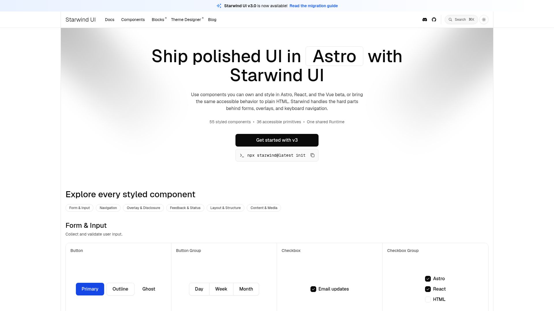
Starwind UI provides a comprehensive library of accessible, styled UI components and primitives designed for developers using Astro, React, and Vue. It enables developers to ship polished, customizable UI elements that handle complex behaviors like forms, overlays, and keyboard navigation, ensuring accessibility and ownership of the source code. Starwind UI supports theming, dark mode, and offers a shared runtime for consistent behavior across frameworks.
55 styled UI components ready to use and customize.
36 primitives with accessible behavior for building custom components.
One runtime that ensures consistent behavior across Astro, React, and Vue beta.
Customize tokens, colors, and typography including dark mode.
Built-in accessible keyboard navigation for overlays and forms.
Command line interface for easy installation and setup.
Support for AI features within the UI components.
Detailed guides and API references for quick onboarding.
Open-source UI component library
Traffic, engagement, sources and keywords are Similarweb-style estimates, refreshed monthly. Verified traffic comes from a connected Google Analytics / Search Console.
 Tailwind CSS4.3.0
 Radix UI
 shadcn/ui
 PWA
PWANo founders named on the site yet. The founder can claim this profile to add themselves.

<a href="https://www.exitfounder.io/startup/starwind-ui" target="_blank" rel="noopener"><img src="https://www.exitfounder.io/badge/starwind-ui.svg" alt="Starwind UI — featured on ExitFounder" width="220" height="56" /></a>Shows live Domain Rating and upvotes for starwind-ui. Cached for an hour.
Have an alternative? Show it to everyone comparing Starwind UI.
Appear on this page Railway
 Astro
Astro Cloudflare
 Umami
Umami